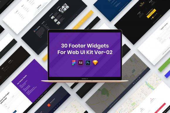
Elevate Your Site with 30 Footer Widgets
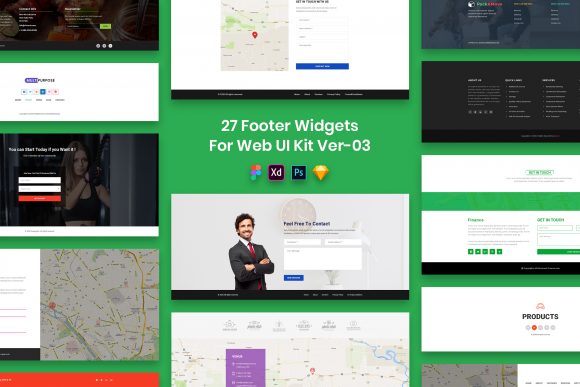
The footer of a website is often treated as an afterthought, a mere repository for copyright notices and broken links. However, for seasoned designers and strategic marketers, the footer represents a critical piece of digital real estate. It is the final handshake with your visitor, the last opportunity to guide them deeper into your ecosystem or reassure them of your credibility. The 30 Footer Widgets for Web UI Kit transforms this overlooked section into a powerhouse of functionality and aesthetic appeal. By providing a comprehensive collection of pre-designed elements, this kit allows creators to bypass the tedious initial drafting phase and focus immediately on refinement and brand alignment.
What makes this specific collection particularly valuable is its commitment to versatility and structural integrity. In the fast-paced world of web development, time is the most scarce resource. Starting from a blank canvas for every new project can lead to design fatigue and inconsistent results. This kit offers thirty distinct variations, ensuring that whether you are building a minimalist portfolio for a photographer or a data-heavy dashboard for a SaaS company, there is a foundational layout ready to be adapted. The designs are not just decorative; they are purposeful elements engineered to improve user experience (UX) by organizing information logically and accessibly.
Unpacking the Creative Potential
The true power of the 30 Footer Widgets for Web UI Kit lies in its adaptability across different creative visions. A common misconception about using UI kits is that they force a generic look upon a project. On the contrary, when used correctly, they serve as a robust skeleton upon which unique brand identities are built. Because the files are fully customizable and feature well-organized layers, designers can deconstruct each widget to suit specific narrative needs.
Consider the variety of approaches one can take. For a corporate entity, the priority might be trust and navigation. You can select a widget style that emphasizes clear sitemap links, contact details, and legal disclaimers, utilizing the pixel-perfect grids to ensure alignment that speaks to professionalism. Conversely, a lifestyle blogger or an e-commerce brand might prioritize community engagement. In this context, you could adapt a widget to highlight social media feeds, newsletter signup forms with compelling copy, or even a curated list of best-selling products. The minimal design aesthetic of the kit ensures that these elements do not clash with the vibrant content above the fold but rather provide a clean, breathing space that grounds the page.
The inclusion of four major file formats—PSD, Figma, Sketch, and Adobe XD—further expands the creative horizon. This cross-platform compatibility means that teams working in different environments can collaborate seamlessly. A freelancer who prefers Sketch can hand off files to a developer who works exclusively in Figma without friction. The retina-ready nature of the assets ensures that whether a user is viewing the site on a high-density mobile screen or a large desktop monitor, the typography and vector elements remain crisp and legible. This attention to technical detail frees the designer to focus on the creative arrangement of content rather than worrying about resolution issues.
Practical Applications for Diverse Users
Different professionals will find unique value in this toolkit depending on their specific goals and audiences. For freelancers and small business owners, speed to market is often critical. Having thirty ready-to-use options means you can present a client with three distinct footer concepts in a fraction of the time it would take to design one from scratch. This efficiency allows for more iterations and feedback loops, ultimately leading to a better final product. The fact that the kit uses free fonts (with links provided in the download package) removes the barrier of licensing costs and font management headaches, making it an economical choice for startups operating on lean budgets.
For educators and publishers, the footer serves as a hub for resources. Using the structured layouts in this kit, one can create sections dedicated to recent articles, academic citations, or departmental contacts. The well-organized layers make it easy to duplicate modules for multi-language sites or to create dynamic areas that change based on the user's location. The clean code structure implied by the organized design files also aids developers in translating these visuals into responsive HTML and CSS, ensuring that the educational content remains accessible across all devices.
Marketers and entrepreneurs can leverage these widgets to drive conversion long after the main call-to-action has been scrolled past. A strategically placed footer can re-engage a bouncing user. By utilizing the "Purposeful Elements" included in the kit, you can insert trust badges, award logos, or a secondary signup form that feels less intrusive than a pop-up. The minimal design ensures these elements don't feel spammy but rather helpful and informative. It is about extending the conversation, not shouting for attention.
Maintaining Clarity and Consistency
While the abundance of options is a strength, it requires a disciplined approach to maintain a cohesive user experience. When integrating the 30 Footer Widgets for Web UI Kit into a larger project, consistency is key. It is tempting to mix and match features from five different widgets, but this can result in a fragmented visual language. Instead, choose one primary structure that aligns with your header and body content, then customize the internal components. Use the easily editable files to adjust padding, color schemes, and typography to match your existing brand guidelines strictly.
To keep results effective, focus on hierarchy. Even within a footer, not all information is equal. Use the varying weights and sizes available in the design files to guide the eye. Primary navigation links should be distinct from secondary legal text. The pixel-perfect nature of the kit helps here; by adhering to the established grid, you ensure that the whitespace works for you, creating a rhythm that makes the information digestible. Remember that a cluttered footer can undermine the cleanliness of the rest of the site. Embrace the minimal design philosophy of the kit to let the content breathe.
It is also important to remember the limitations regarding assets. As noted in the documentation, all images, vectors, and mock-ups seen in previews are for demonstration purposes only and are not included in the download. This encourages creators to use their own photography and custom illustrations, which is actually a benefit. It forces you to inject your own brand personality into the template rather than relying on stock imagery that everyone else might use. The credits for preview assets go to their respective authors, reminding us of the importance of intellectual property and original creation in our own work.
Final Thoughts on Implementation
Incorporating the 30 Footer Widgets for Web UI Kit into your workflow is less about saving time and more about elevating the standard of your output. It provides a professional foundation that respects the user's journey to the very bottom of the page. Whether you are a hobbyist looking to polish a personal blog or an agency delivering high-stakes enterprise solutions, the flexibility of these files supports your ambition. The combination of creative and professional design with technical precision offers a rare balance in the world of UI resources.
Ultimately, the footer is a reflection of how much you care about the details. By using a tool that prioritizes organization, clarity, and adaptability, you signal to your audience that your brand is thorough and reliable. Take these thirty variations, experiment with their structures, and build a footer that doesn't just end the page, but completes the experience.