Maximizing Design Efficiency with the Rejuvenation Centre Web UI Kit
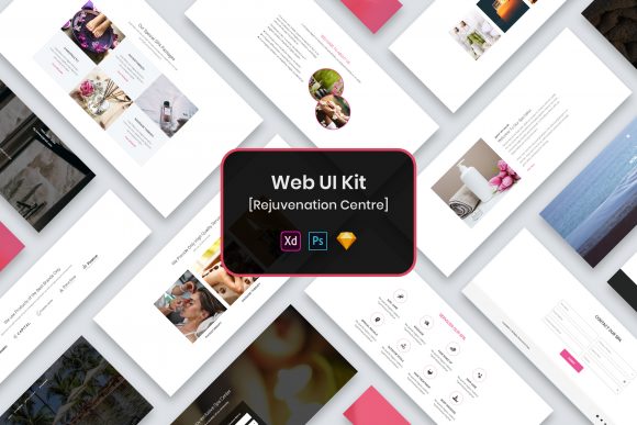
Starting a new web design project often feels like standing at the base of a mountain, looking up at a summit that seems miles away. Whether you are a seasoned developer, a marketing professional launching a landing page, or a small business owner trying to establish an online presence, the initial setup phase can consume valuable time and energy. This is where a robust foundation becomes essential. The Rejuvenation Centre Web UI Kit offers exactly that—a modern, minimal design framework available in PSD, Figma, Sketch, and Adobe XD formats. However, simply downloading a template does not guarantee a successful outcome. Many creators stumble not because the tools are inadequate, but because they misunderstand how to integrate these resources effectively into their workflow.
The primary appeal of this UI kit lies in its versatility and organization. It provides well-organized layers, purposeful elements, and widgets that adhere to a clean aesthetic. Yet, a common mistake beginners and even some professionals make is treating the template as a final product rather than a starting point. When users import the files and immediately begin tweaking colors without understanding the underlying structure, they often create a disjointed user experience. The Rejuvenation Centre Web UI Kit is designed with specific spacing, typography hierarchies, and component relationships. Ignoring these foundational decisions in favor of rapid customization can lead to a site that looks "off" without the designer knowing why. To avoid this, take time to explore the file structure first. Notice how the layers are grouped and how the widgets interact. Understanding the logic behind the layout ensures that your edits enhance the design rather than degrade it.
Navigating Format Compatibility and Workflow Choices
One of the standout features of this package is the inclusion of four major design formats: PSD, Figma, Sketch, and Adobe XD. While this variety is a significant advantage, it frequently leads to decision paralysis or incorrect tool selection. A frequent error occurs when a team chooses a format based on familiarity rather than project requirements. For instance, if your development team relies heavily on hand-off features native to Figma, importing a Sketch file might introduce unnecessary friction during the translation from design to code. Similarly, using a PSD file for a project that requires real-time collaboration can slow down the iteration process significantly.
To make the right choice, evaluate your entire pipeline before opening the files. If you are a freelancer working solo, you might prefer the depth of Photoshop (PSD) for detailed image manipulation. However, if you are part of an agency where multiple stakeholders need to comment on the design, the cloud-based nature of Figma or Adobe XD within this kit would be far more efficient. Selecting the wrong format doesn't just waste time; it can affect the quality of the final deliverable by introducing conversion errors or limiting editability. Always align your file format choice with your team's collaboration style and technical stack.
The Trap of Overlooking Asset Limitations
A critical detail that often causes frustration post-purchase involves the assets included in the download. The documentation for the Rejuvenation Centre Web UI Kit clearly states that images, vectors, and mock-ups are used for preview purposes only and are not included in the actual files. Despite this warning, many users download the kit expecting a fully stocked media library. When they open the file and see placeholder boxes or low-resolution previews, they may feel misled or assume the product is incomplete. This misunderstanding can halt progress and lead to unnecessary support tickets or negative reviews.
The better approach is to view these placeholders as intentional guides. They show you exactly where visual content belongs and what aspect ratios work best with the minimal design theme. Before you start designing, gather your own high-quality photography, brand logos, and custom illustrations. This ensures that the final website reflects your unique brand identity rather than looking like a generic template. Furthermore, the kit mentions that fonts are free and links are provided in a "Fonts Used" file. A common oversight is ignoring this file and substituting fonts arbitrarily. This can break the visual harmony of the minimal design. Always check the recommended typography first; if you must change it, choose alternatives with similar x-heights and weights to maintain the intended balance.
Maintaining Pixel Perfection During Customization
The term "Pixel Perfect" is often thrown around in marketing materials, but achieving it requires discipline from the user. The Rejuvenation Centre Web UI Kit is built with precise alignment and retina-ready standards. A typical pitfall arises when designers resize elements manually instead of using the built-in constraints or auto-layout features available in tools like Figma and Adobe XD. Dragging a button to make it wider might seem harmless, but it can distort padding, misalign text, and ruin the responsive behavior of the component.
To preserve the integrity of the design, utilize the customizable properties provided within the components. Most professional UI kits, including this one, allow you to swap icons, change text, and adjust colors through master component settings. By using these controls, you ensure that every element remains aligned to the grid and retains its crispness on high-density displays. If you find yourself constantly fighting against the template's constraints, it is usually a sign that you are trying to force a square peg into a round hole. In such cases, step back and consider if the existing widget can serve your purpose with minor text adjustments, or if you truly need to build a new component from scratch using the kit's design language as a reference.
Evaluating Long-Term Scalability
Finally, consider the longevity of your project. Entrepreneurs and bloggers often focus on the immediate launch, neglecting how easy it will be to update the site six months down the line. The well-organized layers in this UI kit are a gift for future maintenance. If you rename layers haphazardly or merge groups to "clean up" the file initially, you may regret it when you need to add a new section or change a global color scheme later. Treat the file organization with the same respect you would give to clean code.
Before finalizing your design, run a quick audit. Check that all fonts are correctly linked and that no missing image alerts appear. Verify that the color palette you intend to use has sufficient contrast for accessibility, adhering to web standards. Remember, the goal of using a template like the Rejuvenation Centre Web UI Kit is to accelerate your workflow without sacrificing quality. By avoiding the traps of incompatible formats, misplaced expectations regarding assets, and careless customization, you transform a static template into a dynamic, professional digital presence. Take the time to learn the system, respect the design principles embedded in the file, and you will find that the path from concept to launch becomes significantly smoother and more rewarding.