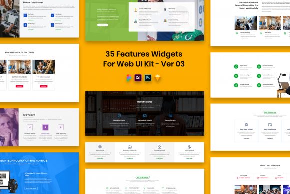
Maximizing Efficiency with the 35 Features Widgets for Web UI Kit
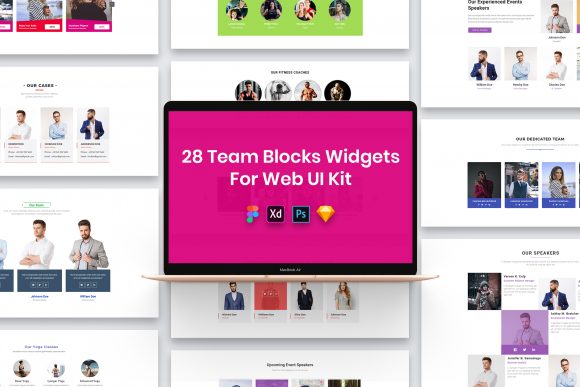
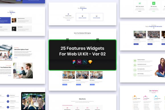
In the fast-paced world of web design, time is often the most valuable currency. Whether you are a seasoned professional managing tight deadlines or an entrepreneur launching your first landing page, the temptation to build every interface element from scratch can be a significant productivity drain. This is where resources like the 35 Features Widgets for Web UI Kit become essential tools in your creative arsenal. However, simply downloading a high-quality asset pack does not guarantee a successful project. Many designers and developers fall into subtle traps when integrating pre-made components, leading to disjointed designs or inefficient workflows. Understanding how to properly leverage this kit, which includes well-organized layers across PSD, Figma, Sketch, and Adobe XD formats, is key to transforming a good idea into a pixel-perfect reality.
The Trap of Ignoring Format Compatibility
One of the most common oversights occurs before the design process even begins: failing to verify software compatibility. The 35 Features Widgets for Web UI Kit is notable for its versatility, offering files in four major formats. Yet, it is surprisingly frequent to see users download the package only to realize they are attempting to open a Sketch file in an older version of Adobe XD, or vice versa. This mismatch leads to frustration and wasted time troubleshooting missing assets or broken layouts.
To avoid this, always assess your current workflow before downloading. If your team collaborates primarily in Figma, prioritize that file type immediately. Do not assume that because a file is "editable," it will translate perfectly across different ecosystems without some manual adjustment. While the kit provides purposeful elements designed to be easily editable, the native features of each software vary. For instance, auto-layout behaviors in Figma differ from stack systems in Sketch. By choosing the correct format from the start, you ensure that the well-organized layers remain intact and functional, preserving the integrity of the minimal design.
Misunderstanding "Pixel Perfect" and Retina Readiness
The terms "pixel perfect" and "retina ready" are often thrown around in marketing copy, but their practical application is frequently misunderstood. When working with the 35 Features Widgets for Web UI Kit, some users assume these labels mean the design will automatically look flawless on any device without further input. This is a dangerous misconception. "Retina ready" implies that the vectors and shapes are created at a resolution that scales cleanly to high-DPI screens, but it does not account for how you implement them in your final code or prototype.
A common mistake is exporting assets directly from the design file without checking the scale factors. If you treat these widgets as static images rather than flexible components, you risk blurring or distortion on modern displays. Furthermore, the kit utilizes free fonts to maintain a clean aesthetic. A critical error many make is neglecting the "Fonts Used" file included in the download package. Without installing these specific typefaces, your layout will default to system fonts, completely breaking the visual hierarchy and professional appearance intended by the creator. Always cross-reference the typography list before presenting your work to clients or stakeholders to ensure the communication remains crisp and consistent.
The Danger of Over-Customization
Because the files in this UI kit are fully customizable, there is a tendency to over-engineer the solution. Beginners and hobbyists, in particular, may feel compelled to alter every color, shadow, and corner radius to make the design "unique." While customization is a strength of this kit, excessive tweaking can undermine the minimal design philosophy that makes these widgets effective in the first place.
The 35 Features Widgets for Web UI Kit was crafted with purposeful elements. Each widget serves a specific function, whether it is a pricing table, a feature grid, or a testimonial slider. When you deviate too far from the original structure, you risk introducing usability issues. For example, reducing the padding too much to fit more content can make the interface feel cramped and difficult to navigate on mobile devices. Instead of reinventing the wheel, use the well-organized layers to adapt the content while respecting the underlying grid and spacing logic. Trust the professional design decisions already made; they are based on established UI patterns that users find intuitive.
Navigating Licensing and Asset Limitations
A crucial area where confusion often arises involves the included imagery. The product description clearly states that all images, vectors, and mock-ups are used for preview purposes only and are not included in the download files. Despite this, users frequently report "missing image" errors or attempt to use the preview graphics in commercial projects, which can lead to copyright infringement issues.
The credits for these preview assets belong to their respective authors, and using them without permission is a violation of intellectual property rights. To avoid legal complications and presentation errors, treat the preview images strictly as placeholders. When preparing your final deliverables, replace them with your own photography, licensed stock images, or client-provided assets. This practice not only keeps you compliant but also ensures that the final product truly reflects the brand identity you are building. Think of the preview images as a wireframe guide—they show you where visual content belongs, but they are not the final product.
Optimizing Your Workflow for Best Results
To get the most out of the 35 Features Widgets for Web UI Kit, adopt a structured approach to integration. Start by auditing the well-organized layers. Good layer naming conventions are a hallmark of professional files, and this kit is no exception. Take a moment to familiarize yourself with the grouping structure. This will save you hours when you need to locate a specific button state or icon later in the project.
Additionally, leverage the multi-format support to your advantage. If you are handing off designs to developers, consider exporting specs from the format they prefer. If your developer works in CSS frameworks, the clean structure of these widgets can often be translated into code more efficiently than a chaotic, custom-built layout. For marketers and bloggers who may not have deep design skills, the ease of editing allows for rapid iteration. You can test different headlines or call-to-action placements within the widgets without needing to redraw the entire section.
Ultimately, the value of this UI kit lies in its balance of flexibility and structure. It provides a solid foundation that prevents you from starting with a blank canvas, yet it offers enough freedom to tailor the experience to your specific needs. By avoiding the pitfalls of format confusion, font neglect, over-customization, and licensing misunderstandings, you can streamline your production process. The result is a higher quality output, reduced time-to-market, and a more professional presentation that resonates with your audience. Whether you are building a complex SaaS dashboard or a simple portfolio site, treating these widgets as strategic tools rather than just decorative clips will elevate the overall quality of your digital presence.