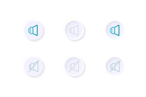
Optimizing Audio Control: A Practical Review of the Volume Adjustment UI Elements Kit
In the landscape of modern mobile application development, the user interface serves as the primary bridge between human intent and digital function. While much attention is rightly paid to navigation flows and data visualization, fundamental controls like audio management often receive less scrutiny until a project nears completion. The Volume Adjustment UI Elements Kit addresses this specific niche by providing a curated collection of design assets focused entirely on sound control interfaces. For professionals ranging from UX designers to independent app developers, having access to high-quality, pre-built components can significantly streamline the workflow. This analysis explores the practical value, technical specifications, and real-world applicability of this resource.
The Core Value of Specialized Interface Assets
Designing a volume slider or a mute toggle might seem trivial at first glance, but these elements carry significant weight in terms of user experience. They must be intuitive, accessible, and visually consistent with the rest of the application. The Volume Adjustment UI Elements Kit distinguishes itself by isolating these specific functions and refining them into a cohesive system. Rather than forcing a designer to construct these vectors from scratch or hunt for inconsistent icons across various libraries, this kit offers a unified solution.
The primary purpose of this collection is to accelerate the prototyping and final design phases for applications requiring multimedia sound options. Whether you are building a music streaming service, a video conferencing tool, or an educational platform with audio lessons, the need for clear volume indicators is universal. By utilizing a dedicated kit, creators ensure that the visual language surrounding audio control remains professional and polished, avoiding the patchwork look that often results from mixing disparate free resources.
Technical Specifications and File Flexibility
One of the most critical aspects of any design asset is its adaptability across different stages of the production pipeline. This kit is delivered in a ZIP file containing a robust array of formats: EPS, JPG, PNG, SVG, and AI. This variety is not merely a bonus; it is a necessity for a flexible workflow.
- AI and EPS: These vector formats are essential for designers who need to modify the geometry of the sliders, bars, or dashboard templates. Being able to edit anchor points in Adobe Illustrator ensures that the elements can be customized to fit unique brand guidelines without losing resolution.
- SVG: For web and mobile implementation, Scalable Vector Graphics are the industry standard. They allow developers to embed the icons directly into the codebase, ensuring crisp rendering on any screen density, from older smartphones to high-resolution tablets.
- PNG and JPG: These raster formats provide immediate usability for quick mockups, presentations, or situations where vector editing software is unavailable. The inclusion of transparent background options in the PNG files is particularly useful for overlaying controls on dynamic video content.
The presence of both light theme interface designs and isolated vector icons suggests a thoughtful approach to versatility. In an era where dark mode is increasingly common, having a solid base in a light theme allows designers to easily invert colors or adjust opacity to create a complementary dark version, rather than starting from zero.
Usability and Visual Consistency
When evaluating the Volume Adjustment UI Elements Kit, the consistency of the visual style stands out as a major strength. The collection includes bar templates, dashboard widgets, and isolated icons that all share a common geometric language. This coherence is vital for maintaining a professional aesthetic within an application. Users subconsciously notice when UI elements feel disjointed; a mismatched volume slider can break the immersion of an otherwise well-designed app.
The "bar and dashboard template" components are particularly noteworthy for their clarity. Effective volume controls must communicate levels instantly. A cluttered or ambiguous slider can lead to user frustration, especially in scenarios where precise audio adjustment is necessary, such as during a live broadcast or while mixing audio tracks. The clean lines and distinct markers found in this kit facilitate quick recognition, reducing the cognitive load on the user.
Furthermore, the isolation of these elements allows for modular usage. A developer might only need the mute icon for a video player header, while another might require the full dashboard template for a settings menu. This modularity ensures that the kit does not feel bloated; instead, it serves as a toolkit where each piece can be deployed independently or as part of a larger system.
Real-World Application Scenarios
To understand the true utility of this resource, one must consider the diverse range of projects it can support. For entrepreneurs launching a Minimum Viable Product (MVP), speed is often of the essence. Using pre-made, high-quality UI elements allows them to focus their limited resources on backend functionality and core features, knowing that the interface looks credible from day one.
Marketers and content creators producing demo videos or promotional materials for apps can also benefit significantly. High-fidelity screenshots and interface mockups are crucial for app store optimization and social media campaigns. The professional quality of the Volume Adjustment UI Elements Kit ensures that marketing collateral reflects a premium product image.
In the education sector, educators and e-learning developers often create interactive courses with embedded audio. Clear, accessible volume controls are essential for inclusivity, ensuring that learners with varying degrees of hearing ability or those using different playback devices can manage their audio environment effectively. The simplicity of the designs in this kit supports accessibility goals by avoiding unnecessary visual noise.
Limitations and Considerations for Integration
While the kit offers substantial value, it is important to approach its integration with a realistic mindset. As a collection of static design assets, it does not include the underlying code or animation logic required to make the sliders functional. Developers will still need to translate these visual designs into interactive components using frameworks like React Native, Flutter, or Swift. The kit provides the "skin," but the "muscle" of interactivity must be built by the engineering team.
Additionally, while the light theme interface is well-executed, teams strictly adhering to a dark-mode-first design philosophy may need to invest time in recoloring and adjusting contrast ratios to meet their specific requirements. However, given the vector nature of the files, this process is generally straightforward for experienced designers.
It is also worth noting that while the collection is comprehensive regarding volume control, it is specialized. It is not a general-purpose UI library. Teams looking for a complete suite of buttons, forms, and navigation elements will need to pair this kit with other resources. Its strength lies in its specificity, not its breadth.
Long-Term Value and Workflow Efficiency
The return on investment for purchasing or utilizing a specialized kit like this is best measured in time saved and quality assured. By eliminating the need to design basic audio controls from scratch, professionals can redirect hours of work toward more complex challenges, such as user flow optimization or feature innovation. The reliability of having a standardized set of icons and templates also aids in long-term maintenance. As an app evolves and new screens are added, designers can pull from the same source files, ensuring that the volume controls introduced in version 2.0 match those in version 1.0.
For freelancers and agencies managing multiple clients, maintaining a library of trusted assets is key to efficiency. The Volume Adjustment UI Elements Kit serves as a reliable staple in such a library. Its compatibility with industry-standard software means it fits seamlessly into existing pipelines without requiring new tools or extensive training.
Final Thoughts on Suitability
Ultimately, the decision to integrate the Volume Adjustment UI Elements Kit into a project depends on the specific needs of the team and the scope of the application. For projects where audio interaction is a secondary feature, the isolated icons may be sufficient. For media-heavy applications where sound control is central to the user experience, the dashboard templates and bar designs offer a robust foundation.
The kit represents a pragmatic choice for adults aged 20 to 50 who are actively engaged in digital creation. Whether you are a seasoned publisher updating a legacy app or a serious hobbyist building your first tool, the professionalism embedded in these vectors elevates the final product. It bridges the gap between conceptual design and production-ready assets, offering a balance of aesthetic appeal and functional clarity that is often difficult to achieve when designing ad-hoc elements.
In a market saturated with generic design resources, specialized collections that focus on doing one thing well are increasingly valuable. This kit succeeds by respecting the importance of even the smallest interface elements, proving that effective design often lies in the details we interact with every second.